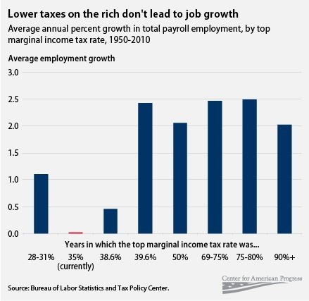
I stumbled on this interesting chart. The data is reported to be from the Bureau of Labor Statistics.
The blogger writes: “In theory, the GOP is so committed to resisting tax hikes because it’s so committed to creating jobs. “The fact is you can’t tax the very people that we expect to invest in the economy and create jobs,” says Speaker John Boehner. But Michael Linden’s chart comparing average annual job creation at different marginal tax rates begs to differ:”
Blog post can be found at: http://www.washingtonpost.com/blogs/ezra-klein/post/tax-rates-and-job-creation-in-one-graph/2011/05/19/AGh9Z1oH_blog.html
Clearly, complex phenomenon like the economy cannot be explained by a single factor. Many things must be aligned. I would still like to know what factors are associated with job growth, but clearly, marginal tax rates do not appear to be the powerhouse that is currently suggested by the “tax cut and spend” folks. To kick start the economy and reduce the debt, we need to have better information than simplistic platitudes. A+ for this chart. It shows the percentage growth in jobs–a much better analytic tool than just the number of jobs, which will reflect the population growth over time. Still, it would nice to have the years, just for context.
