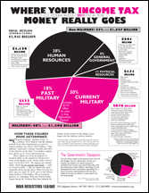
A handout, prepared by the War Resisters League, had the pie chart shown below. As I looked at, it seemed different from the budget figures I had seen. I am used to seeing $3.8 trillion as the spending budget for Fiscal Year 2011 and a smaller percent spent on Defense. I was confused initially, then I remembered: look at what is counted and what is not.
The War Resisters leave out the $726 billion to be spent for Social Security, arguing that that is covered by social security taxes rather than income taxes. It is therefore misleading, in their view, to include social security in calculating the spending distribution of income tax revenues. As a result, the proportion spent on Defense is higher (48%) as compared to the proportion (24%) shown on the offical pie chart.
Does the logic make sense? Or does this fit a politial agenda?
Here is the budget chart:

See the fine print chart at: http://www.warresisters.org/files/FY2011piechart.pdf