A few years ago, I found data that showed the extent to which our economy is based on debt. Not just the federal debt, but the debt accumulated by consumers, banks, and financial institutions. At the time, the federal debt (both public and private debt) was $10 trillion. Consumers had a total of $11 trillion, banks were at $13 trillion and financial institutions were at $17 trillion. Clearly, this was before the economic collapse. I was searching for more current info and came across this site: Grandfather Economic blog by Michael Hodges.
Here is post from 2011–find at: Debt Report
“BIG PICTURE – $57 TRILLION of DEBT in America, and rising rapidly.
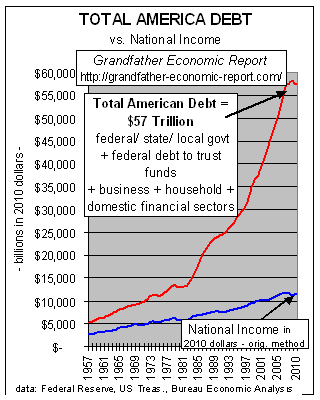
Here’s one graphic of many shown in the main Total Debt Report
 This is A SCARY CHART – showing trends of total debt in America (the red line) reaching $57 trillion in 2010 vs. growth of the economy as measured by national income (blue line). (adjusted for inflation).
Which line goes up faster, the red debt line or the blue net national income line? Answer: the debt line.
And, that debt line has exploded up faster and faster than national income! Right? (maybe, like this chart, your own personal or business debt is also going up faster than your own income – – possible?)
As mentioned, debt is here defined as all U.S. debt (sum debt of federal and state & local governments, international, and private debt, incl. households, business and financial sector debts, and federal debt to trust funds).
This chart shows, for the period 1957 to mid 1970s, total debt (red line on chart) was increasing close to the growth rate of national income (blue line on chart), despite war debt for WW II, Korea and Vietnam.
But, in the last several decades total debt has zoomed up, up and away – – growing much faster than national income. As of beginning 2011 total debt was $57 Trillion ($40.8 trillion private household/business/financial sector debt PLUS $16.2 trillion federal, state and local government debt).”