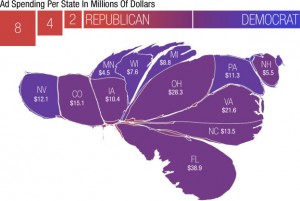
 NPR did this cool graphic looking at the voting map and showing how it looks in terms of the amount of money spent in each state for 2012 election.
Check it out: Map Morphed by Money
 NPR did this cool graphic looking at the voting map and showing how it looks in terms of the amount of money spent in each state for 2012 election.
Check it out: Map Morphed by Money