Have the Anti-Poverty Programs Failed?

The growing consensus is that the war on poverty has not failed once you use more appropriate measures, according to John Cassidy in the New Yorker. To see the article: Click Here.

He shows a chart using the official poverty measure. The official poverty measure was created in 1963 based on a multiple of a thrifty meal plan.  It has long been regarded as an inaccurate measure in terms of actually measuring what people need to meet basic costs of living (technical term: it lacks content validity). However, it has the benefit of being reliable because it is the same measure merely adjusted for inflation, so it is an apples-to-apples comparison.

Poverty different measures Cassidy


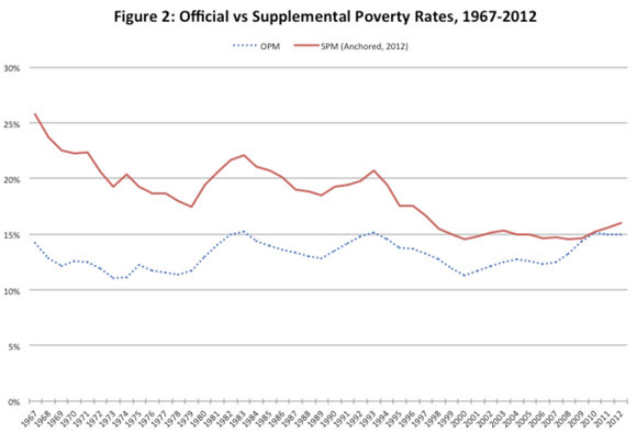
Other measures have been proposed, and he shows how the data looks using a revised measure created by the Census Bureau and used by researchers to do a more accurate analysis. Cassidy writes about the solid red line: “It represents the Columbia researchers’ estimate of historical poverty rates according to a new and more comprehensive measure of need that the Census Bureau created in 2011, known as the supplemental poverty measure (S.P.M.). According to this revised metric, the poverty rate in 1967 was as high as twenty-six per cent. It has since fallen dramatically, to sixteen per cent in 2012; in the period immediately before the Great Recession, it fell below fifteen per cent.” Continue reading »

Public Agrees on Obesity’s Impact, Not Government’s Role

PEW just published survey results on views about the government’s role in reducing obesity. Basically, the PEW survey found that people opined that obesity has an impact on society, but did not see much of role for government action. PEW summed it up: Yes to Calories on Menus, No to Soda Limits.

PEW writes: “Most Americans (69%) see obesity as a very serious public health problem, substantially more than the percentages viewing alcohol abuse, cigarette smoking and AIDS in the same terms. In addition, a broad majority believes that obesity is not just a problem that affects individuals: 63% say obesity has consequences for society beyond the personal impact on individuals. Just 31% say it impacts the individuals who are obese but not society more broadly.”

Read the story: Click Here
PEw obesity views


Continue reading »

Link Between Antibiotics and Obesity?

Mother Jones printed an article today by Kiera Butler and Jaeah Lee looking at the link between antibiotics and obesity.
(The Mysterious Link Between Antibiotics and Obesity:States where doctors prescribe more antibiotics also have the highest obesity rates. Why?)

The authors write: “Lately, I’ve been fascinated by a study on antibiotic prescription rates across the United States that was recently published in the New England Journal of Medicine. The researchers found a surprisingly wide variation among the states, and the rates—expressed in terms of prescriptions per 1,000 people—seemed to follow a geographical pattern: The Southeast had the highest rates, while the West’s were lower. West Virginia had the most prescriptions, and Alaska had the fewest. The rest of the country fell somewhere in between.”
Here’s a map of the findings:

antibiotics-map-01


Continue reading »

Income Inequality continued

The Center on Budget Policy and Priorities has provided more information about the latest Census report on Poverty and Health Insurance. Once chart compares the income shares by quintiles of 1967 and 2012.
income shares


To read article: Click Here

The article notes that there may be some challenges in accurately capturing the income of those at the very top, and therefore accurately measuring changes. They write:
“Other data suggest the Census figures may underestimate the rise in inequality. Census trends on income inequality must be regarded cautiously because of large gaps in the Census income data, especially the omission of substantial income going to people high on the income scale. For example, Census does not collect data either on capital gains income or on salaries above $1,099,999; an individual whose salary rises from $20 million to $25 million between 2011 and 2012 is recorded as earning $1.1 million in both years.”

How the 1 percent made out during the recovery

Clearly, the issue of income and income inequality is trending. Among the articles with data is one from the Washington Post. It is a chart that shows how the top 1 percent made out over the past twenty years as compared to everyone else. It is also a good example of how simple averages can mislead–the difference between the overall average and the average for the 1 percent and the other 99 percent are quite different.

1 percent recovery


See article: Click Here


More on Income Inequality

The Center for Budget Policy Priorities posted a guide to historical trends on Income Inequality. Clearly, income inequality has been growing since the 1970s, returning to a level not seen since the Great Depression (1929). See the full report: Click Here
Among the many charts and tables, I think these two are very interesting.
One shows a comparison between income distribution and wealth distribution:

cbpp wealth and income distribution


The second shows the distribution of income before and after taxes. There is a redistributive effect, but not as much as I assumed there would be:

cbpp income before and after taxes

Cost of Health Insurance

An article in the NY Times’ Economix by UWE E. REINHARDT reports on the Kaiser Family Annual Survey findings on the cost of health insurance: “The survey in question is the Kaiser Family Foundation’s annual survey of employment-based health insurance, widely viewed as a gold mine for anyone seeking information on that part of the American health system. The full report is easily accessible, or readers may prefer to read just the summary or browse through the fine group of charts the foundation provides. Here is a telling chart from that pack.”

This chart, shows the costs (not controlled for inflation–i.e. current dollars) over time and doesn’t compare benefit packages–so there are some caveats here. If I was assigning a research project, I would ask students to look at the rate of inflation over this same time period and look at rates of change, to see whether the insurance premiums have tracked with inflation. Alternatively, I could ask students to to convert these to constant dollars, so that the rate of inflation is controlled and therefore can be compared.
health insurance chart


To read the NY Times post: Click Here