Jon Stewart takes on Medicaid expansion: see here for as long as this link lasts: Click Here Or try this:Click Here Some charts to make his point.
The first one is from American Prospect:Link. Chart 1: 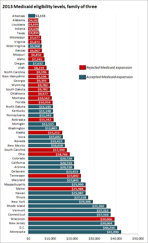
The second chart is what the data looks like when presented as a map of the US, prepared by the Advisory Board: Link to Advisory Board. Chart 2: 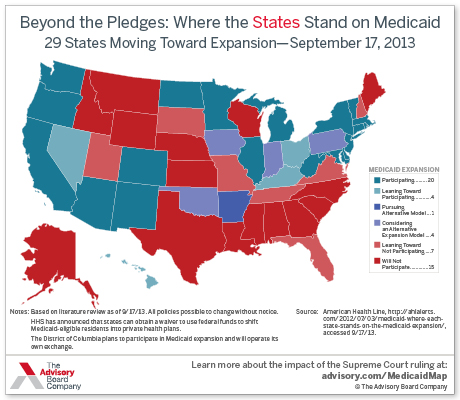
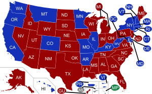
The third is a map of the state governorships by party. It appears that that many of the states refusing to expand Medicaid to cover the working poor as part of the Affordable Care Act (aka ObamaCare) have Republican governors. This is from WikiPedia: Link Chart 3:
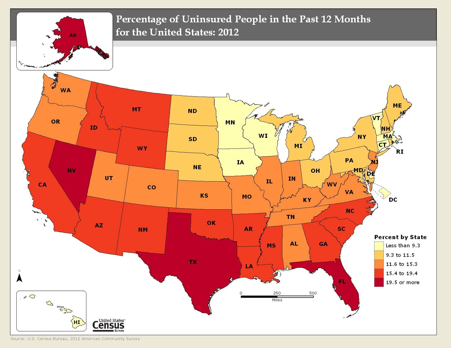
Of course, researchers might want to look at data the helps to understand the need. Do states that expand Medicaid have greater need? Need could be defined as the number of people living in poverty or the rates of various diseases such as diabetes, heart disease, hypertension, cancer, etc etc. Or maybe they would want to look at the percent of uninsured in the states. Chart number 4 is from the U.S. Census Find article at: Click here