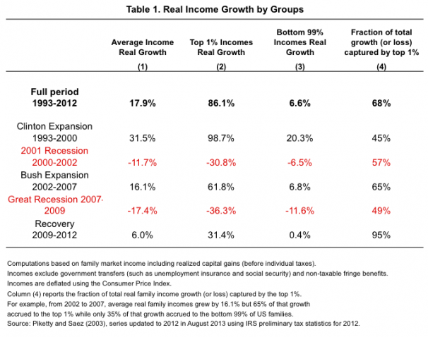
Clearly, the issue of income and income inequality is trending. Among the articles with data is one from the Washington Post. It is a chart that shows how the top 1 percent made out over the past twenty years as compared to everyone else. It is also a good example of how simple averages can mislead–the difference between the overall average and the average for the 1 percent and the other 99 percent are quite different.
See article: Click Here