This video came across my computer screen today. It is taking graphic representation to a new level.
Check it out: Video by Evan Klassen
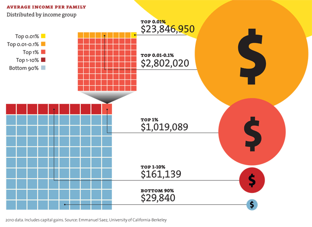
Of course, it helps to know what he defines as “wealth.” It means tracking down the Harvard study as a starting point. Still, as an example of the use of graphics, it does a good job of presenting a complex set of data.More data can be found at Mother Jones: It’s the Inequality, Stupid. Mother Jones puts it all in charts.
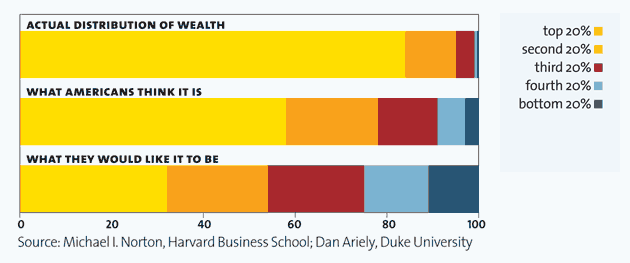
This is the chart that the video leads with–comparing the different in perceptions and reality about wealth distribution.
