Comparing the Cost of Living

ADT created a resource and tool comparing the cost of living across the U.S. The interactive is fun to use. It can be found at:  https://www.adt.com/where-our-money-goes

The key is the methodology and they provide a general description, a link to the primary source material, and links to other sources.

Methodology

Many thanks to The Council for Community and Economic Research for letting us explore their data set: the 2018 Cost of Living Index (http://www.coli.org). The Cost of Living Index is designed to measure “relative differences among urban areas in the cost of consumer goods and services appropriate for professional and managerial households in the top income quintile.” For this analysis, we used their data set from Q3 2018.

We analyzed several sections of their data, including the cost of living indexes for transportation, utilities, and groceries in 263 major U.S. metropolitan areas. We also made use of their average price data for coffee, fried chicken (two pieces), pizza, yoga, and movie tickets. Our visualizations only include the highest- and lowest-priced areas for each purchase category. Continue reading »

A Guide to Statistics on Historical Trends in Income Inequality

The Center for Budget and Policy Priorities released a new report of income inequality in the U.S. Click Here.

The report provides detail about the data used to analyze income and wealth inequality and a serious analysis. Excellent for use in a research methods class.

The summarized the basic facts of income inequality over the past six decades :

  • “The years from the end of World War II into the 1970s were ones of substantial economic growth and broadly shared prosperity.
    • Incomes grew rapidly and at roughly the same rate up and down the income ladder, roughly doubling in inflation-adjusted terms between the late 1940s and early 1970s.
    • The income gap between those high up the income ladder and those on the middle and lower rungs — while substantial — did not change much during this period.
  • Beginning in the 1970s, economic growth slowed and the income gap widened.
    • Income growth for households in the middle and lower parts of the distribution slowed sharply, while incomes at the top continued to grow strongly.
    • The concentration of income at the very top of the distribution rose to levels last seen more than 80 years ago (during the “Roaring Twenties”).
  • Wealth — the value of a household’s property and financial assets, minus the value of its debts — is much more highly concentrated than income.  The best survey data show that the top 3 percent of the distribution hold over half of all wealth.  Other research suggests that most of that is held by an even smaller percentage at the very top, whose share has been rising over the last three decades.”


PEW: Cost of Not Going to College

Pew education income disparityOver the years, there has been a lot of news articles suggesting that it was not cost-beneficial to go to college.  PEW has just come out with a study tells a very different story for the millennials.
PEW writes: “On virtually every measure of economic well-being and career attainment—from personal earnings to job satisfaction to the share employed full time—young college graduates are outperforming their peers with less education. And when today’s young adults are compared with previous generations, the disparity in economic outcomes between college graduates and those with a high school diploma or less formal schooling has never been greater in the modern era.”
Read article: Click Here

Politics: Lies and Deception

The Congressional Budget Office released its economic outlook report that included two appendices that dealt specifically with the Affordable Health Care Act.click here

Because a number of people work full-time solely to maintain insurance coverage (either because the cost of obtaining individual insurance would be prohibitive or because they would be unable to obtain any insurance because of pre-existing conditions), the Affordable Care Act will give people some options. CBO estimates that a number of people will opt to stop working or reduce their hours because they will have access to health insurance that no longer requires them to work full-time. For some, they might opt to retire at age 62, three years before they are eligible for Medicare. For others, they might decide to leave the workplace and start their own business or go back to school  to launch a new career. For some, they will be able to drop down to a 32-hour workweek, to better meet the needs of their family.  No doubt there are many other reasons.

Krugman says this was always known and CBO puts the estimate at around 2 million in this report. He then reports the tweet by Representative Eric Cantor, the House majority leader:  “Under Obamacare, millions of hardworking Americans will lose their jobs and those who keep them will see their hours and wages reduced.”  See: Twitter account

From my perspective, outright lies do not serve the public interest. It is one thing to disagree about a public policy, but deception, distortion, spinning–whatever it is called–is still a lie.  And if a lie is the only thing you can say, then maybe it is time accept that you have no valid point and should just be quiet.

Continue reading »

NY Times: Consumption of Middle Class Declines

In today’s New York Times, a story reports the decline of middle class consumption:
“As politicians and pundits in Washington continue to spar over whether economic inequality is in fact deepening, in corporate America there really is no debate at all. The post-recession reality is that the customer base for businesses that appeal to the middle class is shrinking as the top tier pulls even further away.”

“The top 5 percent of earners accounted for almost 40 percent of personal consumption expenditures in 2012, up from 27 percent in 1992. Largely driven by this increase, consumption among the top 20 percent grew to more than 60 percent over the same period”  The bottom 80 percent accounted for just 39 percent in 2012, down from 47% in 1992.

The impact on the economy is noticeable.  Upscale products and services are booming Stores that serve the middle class are not. “Sears and J. C. Penney, retailers whose wares are aimed squarely at middle-class Americans, are both in dire straits. Last month, Sears said it would shutter its flagship store on State Street in downtown Chicago, and J. C. Penney announced the closings of 33 stores and 2,000 layoffs.”

The article gives some examples  of the impact of income inequality in terms of restaurants:

“Foot traffic at midtier, casual dining properties like Red Lobster and Olive Garden has dropped in every quarter but one since 2005, according to John Glass, a restaurant industry analyst at Morgan Stanley. With diners paying an average tab of $16.50 a person at Olive Garden, Mr. Glass said, “The customers are middle class. They’re not rich. They’re not poor.” With income growth stagnant and prices for necessities like health care and education on the rise, he said, “They are cutting back.” On the other hand, at the Capital Grille, an upscale Darden chain where the average check per person is about $71, spending is up by an average of 5 percent annually over the last three years.”

Read article: Click Here

Calculating the Minimum Wage

From Poverty In America’s living wage calculator:
“The original calculator was modeled after the Economic Policy Institute’s metropolitan living wage tool. Users should know there are many researchers contributing tools and resources to the movement to achieve living wages. Diana Pearce at the University of Washington, Seattle is an important contributor to the living wage movement. Her work provides an alternative calculator.”

“Our tool is designed to provide a minimum estimate of the cost of living for low wage families. The estimates do not reflect a middle class standard of living. The realism of the estimates depend on the type of community under study. Metropolitan counties are typically locations of high cost. In such cases, the calculator is likely to underestimate costs such as housing and child care. Consider the results a minimum cost threshold that serves as a benchmark, but only that. Users can substitute local data when available to generate more nuanced estimates. Adjustments to account for local conditions will provide greater realism and potentially increase the accuracy of the tool. As developed, the tool is meant to provide one perspective on the cost of living in America.”

“The living wage shown is the hourly rate that an individual must earn to support their family, if they are the sole provider and are working full-time (2080 hours per year). The state minimum wage is the same for all individuals, regardless of how many dependents they may have. The poverty rate is typically quoted as gross annual income. We have converted it to an hourly wage for the sake of comparison. Wages that are less than the living wage are shown in red.”
Living Wage Calculator Click Here


How Much Money Do People Need to Live?

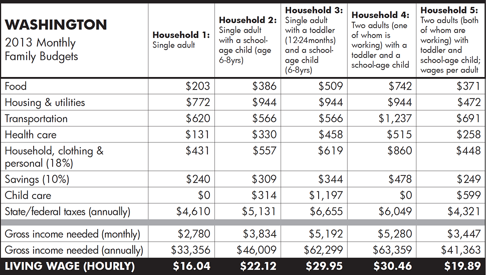
A new study looks at Washington state.  It provides estimates for various family configurations and provides this analysis.

washington living wage

Read the report:Click Here

The report does not state how it came up with these figures. Nor does it take into account regional differences.

The chart would have been better if the taxes were shown on a monthly basis, so that it addes to the gross income needed monthly.

The taxes seem high for this group, especially for federal income tax. Federal income tax might be deducted, but this income group should get refunds, and some might get the EITC. But they would still have to pay social security tax and medicare. Washington has a sales tax but no income tax, so figuring out that might be tricky.

While there might be some ways to cut spending–single people might opt for co-housing, for example–still, it takes quite a bit to cover basic living costs. Looking at the hourly wage, it seems clear that the $9 minimum wage in Washington is not going to be sufficient.

At the national level, the minimum wage has not kept up the rising living costs over time.  It is time for a major adjustment.

How the 1 percent made out during the recovery

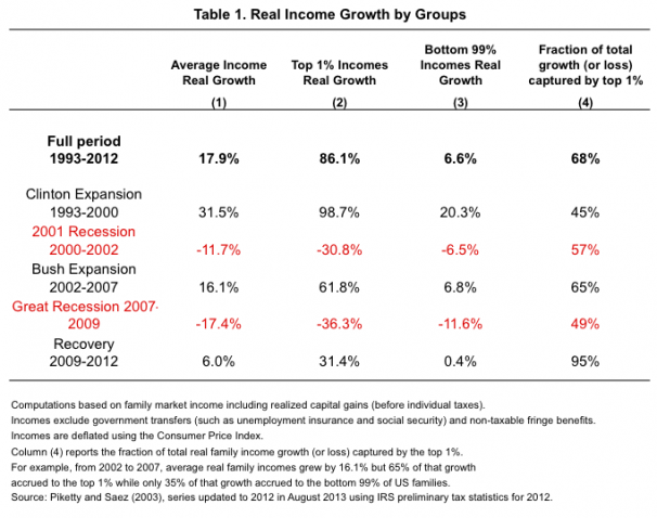
Clearly, the issue of income and income inequality is trending. Among the articles with data is one from the Washington Post. It is a chart that shows how the top 1 percent made out over the past twenty years as compared to everyone else. It is also a good example of how simple averages can mislead–the difference between the overall average and the average for the 1 percent and the other 99 percent are quite different.

1 percent recovery


See article: Click Here


More on Income Inequality

The Center for Budget Policy Priorities posted a guide to historical trends on Income Inequality. Clearly, income inequality has been growing since the 1970s, returning to a level not seen since the Great Depression (1929). See the full report: Click Here
Among the many charts and tables, I think these two are very interesting.
One shows a comparison between income distribution and wealth distribution:

cbpp wealth and income distribution


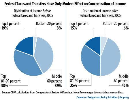
The second shows the distribution of income before and after taxes. There is a redistributive effect, but not as much as I assumed there would be:

cbpp income before and after taxes