CBO released a report today about Unemployment Insurance. “The unemployment insurance (UI) system is generic cialis online a partnership between the federal government and state governments that cialisonline-storeedtop provides a temporary weekly benefit to qualified workers who lose their job and are seeking work. overnight viagra The amount of that benefit is based in part on a worker’s past earnings. CBO estimates that UI benefits totaled $94 billion in fiscal year 2012 (when viagra en video the unemployment rate was 8.3 legal canadian pharmacy online percent, on average), a substantial increase over cialis online the $33 billion paid out in fiscal year 2007 (when the unemployment rate was 4.5 percent, on average).” 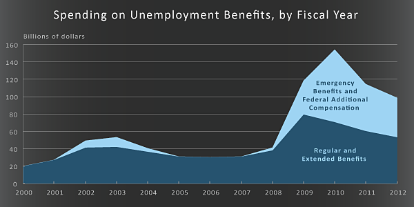 See Report Here
Category Archives: Charts
CBO Presentation: Using Analytical Models and Communicating Their Findings
CBO made a presentation about using analytical models and disseminating information. It provides a description about how a few of their key models are created and some great examples of charts they created to present that information. Find it here:
Using Analytical Models: A CBO Presentation
Interesting Video Explaining Where the 2000-2011 Federal Debt Came From
Video
Developed by the Center for American Progress
US Map: electoral college and money spent on campaigns
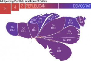 NPR did this cool graphic looking at the voting map and showing how it looks in terms of the amount of money spent in each state for 2012 election.
Check it out: Map Morphed by Money
The Debt Merry-go-Round: cool chart
The Economist has a very cool interactive chart that looks at world debt as a percentage of GDP. Yes, it is possible to have more debt than the Gross Domestic Product.
Compare the countries:
World Debt: The Economist
September 2012.
CBO: Choices for Federal Spending
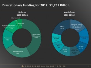 This came into my email. It is a great summary of the federal budget
and national debt situation:
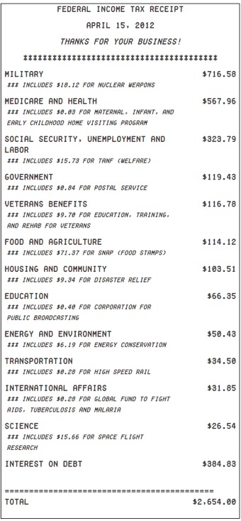
Federal Income Tax Receipt–2012
The National Priorities Project has provided a report on our federal tax dollars at work.
“While you may not get a receipt from the IRS any time soon, National Priorities Project went ahead and wrote one up. This receipt shows where $2,654 in income taxes was spent by the government in fiscal 2011. That’s an estimate of the taxes paid by a single person earning around $30,000 annually.”
It should be noted that they do not include payroll taxes that are designated for Social Security and Medicare Trust Funds.
Still, it is an interesting way to present budget data.
Source: National Priorities Project: Your Tax Receipt
Great Visual Display of Data
Unemployment Map: Over Time
This is an interesting map of unemployment rates across the country over the past few years.
http://cohort11.americanobserver.net/latoyaegwuekwe/multimediafinal.html
Budget Deficit–Are Tax Increases Needed?
Common Dreams had an interesting article as the budget deficit as crisis story picks up traction. “Who Ate the Dessert? Deficit Mania Ignores Growth of Income Gap by Neil DeMause.
(note: when reading this material, one has to be be clear whether they are talking about the average budget deficit–which in 2010 is over a historic $1 trillion– or whether they are talking about the national debt , which is the cumulative total that is now $12 trillion.
http://www.commondreams.org/view/2010/06/14-3 Continue reading
