“A Stormy Reminder of Why We Need Government”

Published on Wednesday, October 31, 2012 by Commons Dreams

A Stormy Reminder of Why We Need Government
A job well done, from the local 911 switchboard to the White House
by David Morris

If this election is a referendum on the benefit of government then superstorm Sandy should be Exhibit A for the affirmative. The government weather service, using data from government weather satellites delivered a remarkably accurate and sobering long range forecast that both catalyzed action and gave communities sufficient time to prepare. Those visually stunning maps you saw on the web or t.v. were largely based on public data made publicly available from local, state and federal agencies.

As the storm neared, governors and mayors ordered the evacuation of low lying areas. Police and firefighters ensured these orders were carried out and helped those needing assistance. As the storm hit, mayors imposed curfews.

Government 911 and 311 telephone operators quickly and effectively responded to hundreds of thousands of individual calls for assistance and information. Indeed, the volume of those calls may lead us to propose a different answer to the question asked by those famous lines from the movie Ghostbusters. “If there’s something weird and it don’t look good who ya gonna call?” Government. Continue reading »
PEW: How Well is News Informing Americans?

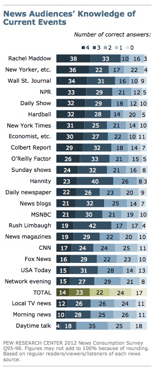
From the report: “The public was asked four questions to measure knowledge of political news and current events. The questions concern which party controls the House of Representatives, the current unemployment rate, the nation that Angela Merkel leads and which presidential candidate favors taxing higher-income Americans. Overall, just 14% of the public got all four questions right. Slightly more people (17%) got all four wrong. Most news audiences, however, scored substantially better than the public.”

The best audience: Rachel Maddow’s (38 percent could answer all four questions).


Read Report: PEW Report Continue reading »

How Much Money Defines Middle-Class?

The story making the circuit today about Presidential candidate Mitt Romney is this: “According to his response to a question about whether or not he considers “middle class” income for Americans to be somewhere around “$100,000” by ABC’s George Stephanopoulos on Friday, Romney rejected that number. “No,” Romney said. “Middle income is $200,000 to $250,000 and less.” Really? According to the latest report from the Census Bureau, 4% of all households in American earned more than $200,000 in 2011. Or put another way, 96% of American households earned less than $200,000. Does not sound like the middle to me. Census Report: Click Here What might be a better measure? In Table A-1, Households by Total Money Income, the Census reports that: the median household income (that is, the income where 50% of the population is above and 50% is below) is $50,054. This is less than the high of $54,546 in 2007; since the economic crash, median income has been on a downward slide since 2007 and has not bottomed yet. Of course, we could look at the mean (average) household income. That is higher at $69,677, but still shows a decline from a peak in 2006 of $74,259. Generally, when dealing with income, the median income is a better description of where the middle is; averages can be distorted by very high earnings. Still–$54,00 or $69,000 is a long way from $200,000. Continue reading »

PEW: Rise of Income Segregation

Pew releases a study by  Paul Taylor and Richard Fry that found a rise in income segregation by neighborhood:

Here is what they said in brief

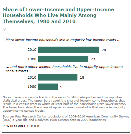
“Residential segregation by income has increased during the past three decades across the United States and in 27 of the nation’s 30 largest major metropolitan areas, according to a new analysis of census tract2 and household income data by the Pew Research Center.The analysis finds that 28% of lower-income households in 2010 were located in a majority lower-income census tract, up from 23% in 1980, and that 18% of upper- income households were located in a majority upper-income census tract, up from 9% in 1980.

Read article: Income Segregation

Excellent Sources of Election Information

For political junkies, there are several websites that provide useful data.
One is a site that tracks voter participation. The percent of eligible voters who are actually participating in primaries is rarely reported in the news stories. Some wins are just not representative of many voters.
It can be found at: U.S. Elections Project
It is maintained by Dr. Michael McDonald, an Associate Professor at George Mason University. This is a great public service. Thank you! He also provides participation tables on primaries and general elections for even years from 2000-2010. With this data, you can determine whether voter participation is different in 2012 than in prior years, if you are looking for a research project.
You would need to look at other sources to find out who won those primaries though. The NY Times provides a table of the delegate counts, which shows who won. Another interesting research project is to try and determine whether there is anything about the percent of voter turnout and who wins. Continue reading »

Fact Checking: Obama Adds More People to Foodstamps?

 “Newt Gingrich claims that “more people have been put on food stamps by Barack Obama than any president in American history.” He’s wrong. More were added under Bush than under Obama, according to the most recent figures. Gingrich would have been correct to say the number now on food aid is historically high. The number stood at 46,224,722 personsas of October, the most recent month on record. And it’s also true that the number has risen sharply since Obama took office.

But Gingrich goes too far to say Obama has put more on the rolls than other presidents. We asked the U.S. Department of Agriculture’s Food and Nutrition service for month-by-month figures going back to January 2001. And they show that under President George W. Bush the number of recipients rose by nearly 14.7 million. Nothing before comes close to that.” Continue reading »

PEW’s Journalism Center Offers Candidate Tracking Tools

Drawing on its analysis of campaign media coverage, the Pew Research Center’s Project for Excellence in Journalism has created a package of tools that let you track the volume and tone of coverage for each candidate, and the volume and tone of the conversation in Twitter. The tools also provide a gateway to data from other sources about media and public interest in the campaign. Use the tools

http://features.journalism.org/campaign-2012-in-the-media/tone-of-news-coverage/

Of course, the question for us here is the methodology used: what do they count and how do they count it?

“The Corporations That Occupy Congress”

 The Corporations That Occupy Congress, by David Cay Johnston

Published on Tuesday, December 20, 2011 by Reuters, and posted to Common Dreams

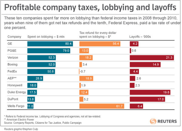
 “Some of the biggest companies in the United States have been firing workers and in some cases lobbying for rules that depress wages at the very time that jobs are needed, pay is low, and the federal budget suffers from a lack of revenue.

 Last month Citizens for Tax Justice and an affiliate issued “Corporate Taxpayers and Corporate Tax Dodgers 2008-10″. ( link: http://www.ctj.org/corporatetaxdodgers/CorporateTaxDodgersReport.pdf)  It showed that 30 brand-name companies paid a federal income tax rate of minus 6.7 percent on $160 billion of profit from 2008 through 2010 compared to a going corporate tax rate of 35 percent. All but one of those 30 companies reported lobbying expenses in Washington.

Continue reading »

The Debt: CNN Poll

CNN posted polling results: “Debt ceiling deal should include cuts and tax increases”
The story by CNN’s Rebecca Stewart

“According to a CBS News Poll released Monday, 66 percent of Americans say an agreement to raise the amount of money the nation can borrow should include both spending cuts and tax increases.

More than half of Republicans say the agreement should be balanced and roughly seven out of ten Democrats and independents say the same. More tea party supporters also agree, since 53 percent say any deal should include both spending cuts and tax increases.

Republicans and adults who identify with the tea party are more likely than Democrats or independents to support a plan that only includes spending cuts. Almost four in 10 Republicans favor using spending cuts alone to reduce the deficit and 44 percent of tea party supporters agree. Twenty percent of Democrats would leave tax increases out of a debt ceiling deal and include cuts only; 28 percent of independents say the same.”

Methodology: The CBS New Poll was conducted by telephone among 810 adults nationwide from July 15-17. It has a sampling error of plus or minus four points.

Will Congress reflect these views? We will know soon, as the clock is ticking down.

See article: Debt Ceiling Poll

Public and Private Sector Pay Comparisons

The New York Times offers some data to help make sense of the debate about who earns more: people in the public sector or people in the private sector?

When lumped together, it would appear that on average, the public sector earns more when benefits are included.
But they acknowledge this comparison is difficult because a greater percent of people in state and local government have college degrees than people in the private sector. As a general rule, people with higher degrees tend to earn more than those with just a high school degree.

The best analysis would compare by education level: people with high school, college, and masters degrees in the public and private sector. In social science jargon: the analysts should be controlling for educational levels.
See New York Times Data
Continue reading »