PEW’s New Study: Decade of Decline for the Middle Class

PEW released a study looking at the changes in income and wealth of the middle class, along with their assessment of who is to blame.

The report states:

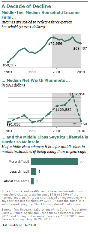
“Since 2000, the middle class has shrunk in size, fallen backward in income and wealth, and shed some—but by no means all—of its characteristic faith in the future.

These stark assessments are based on findings from a new nationally representative Pew Research Center survey that includes 1,287 adults who describe themselves as middle class, supplemented by the Center’s analysis of data from the U.S. Census Bureau and Federal Reserve Board of Governors.

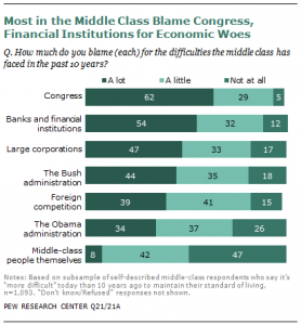
Fully 85% of self-described middle-class adults say it is more difficult now than it was a decade ago for middle-class people to maintain their standard of living. Of those who feel this way, 62% say “a lot” of the blame lies with Congress, while 54% say the same about banks and financial institutions, 47% about large corporations, 44% about the Bush administration, 39% about foreign competition and 34% about the Obama administration. Just 8% blame the middle class itself a lot.”


Find the report here
PEW: Rise of Income Segregation

Pew releases a study by  Paul Taylor and Richard Fry that found a rise in income segregation by neighborhood:

Here is what they said in brief

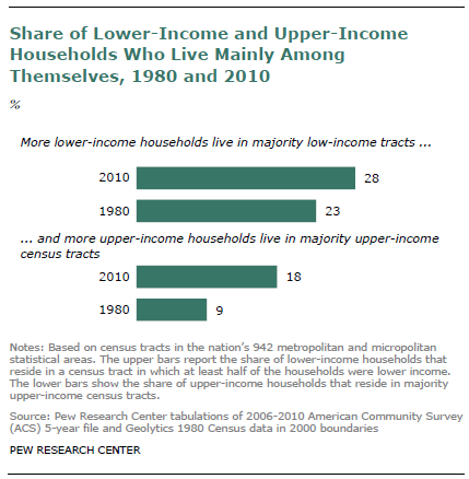
“Residential segregation by income has increased during the past three decades across the United States and in 27 of the nation’s 30 largest major metropolitan areas, according to a new analysis of census tract2 and household income data by the Pew Research Center.The analysis finds that 28% of lower-income households in 2010 were located in a majority lower-income census tract, up from 23% in 1980, and that 18% of upper- income households were located in a majority upper-income census tract, up from 9% in 1980.

Read article: Income Segregation

Debt in America

A few years ago, I found data that showed the extent to which our economy is based on debt. Not just the federal debt, but the debt accumulated by consumers, banks, and financial institutions. At the time, the federal debt (both public and private debt) was $10 trillion. Consumers had a total of $11 trillion, banks were at $13 trillion and financial institutions were at $17 trillion. Clearly, this was before the economic collapse. I was searching for more current info and came across this site: Grandfather Economic blog by Michael Hodges.
Here is post from 2011–find at: Debt Report

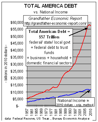
“BIG PICTURE – $57 TRILLION of DEBT in America, and rising rapidly.
Here’s one graphic of many shown in the main Total Debt Report

This is A SCARY CHART – showing trends of total debt in America (the red line) reaching $57 trillion in 2010 vs. growth of the economy as measured by national income (blue line). (adjusted for inflation).

Which line goes up faster, the red debt line or the blue net national income line? Answer: the debt line.

And, that debt line has exploded up faster and faster than national income! Right? (maybe, like this chart, your own personal or business debt is also going up faster than your own income – – possible?)

As mentioned, debt is here defined as all U.S. debt (sum debt of federal and state & local governments, international, and private debt, incl. households, business and financial sector debts, and federal debt to trust funds).

This chart shows, for the period 1957 to mid 1970s, total debt (red line on chart) was increasing close to the growth rate of national income (blue line on chart), despite war debt for WW II, Korea and Vietnam.

But, in the last several decades total debt has zoomed up, up and away – – growing much faster than national income. As of beginning 2011 total debt was $57 Trillion ($40.8 trillion private household/business/financial sector debt PLUS $16.2 trillion federal, state and local government debt).”

More Evidence of Income Decline

The Federal Reserve Board released its survey results in June 2012. It focused on changes from 2007 to 2010.

The report states:

“The Federal Reserve Board’s Survey of Consumer Finances (SCF) for 2010 provides insights into changes in family income and net worth since the 2007 survey. The survey shows that, over the 2007–10 period, the median value of real (inflation-adjusted) family income before taxes fell 7.7 percent; median income had also fallen slightly in the preceding three-year period (figure 1). The decline in median income was widespread across demographic groups, with only a few groups experiencing stable or rising incomes.Most noticeably, median incomes moved higher for retirees and other nonworking families. The decline in median income was most pronounced among more highly educated families, families headed by persons aged less than 55, and families living in the South and West regions. Real mean income fell even more than median income in the recent period, by 11.1 percent across all families. The decline in mean income was even more widespread than the decline in median income, with virtually all demographic groups experiencing a decline between 2007 and 2010; the decline in the mean was most pronounced in the top 10 percent of the income distribution and for higher education or wealth groups. Over the preceding three years, mean income had risen, especially for high-net-worth families and families headed by a person who was self-employed.

The decreases in family income over the 2007−10 period were substantially smaller than the declines in both median and mean net worth; overall, median net worth fell 38.8 percent, and the mean fell 14.7 percent (figure 2).”

See full report:Federal Reserve Board–Survey of Consumer Finances

This tracks with figures released by the Congressional Budget Office–Trends in the Distribution of Household income, comparing 1979 and 2007. Continue reading »

Food Stamps: CBO Reports

Some great information about federal food stamps program published by the Congressional Budget Office:
Supplemental Nutrition Assistance Program

SNAP spending and participation reached record levels in 2011. Nearly 45 million recipients, one out of every seven U.S. residents, received SNAP benefits in an average month in fiscal year 2011. Total federal spending for the program was $78 billion.

To put it in context of daily life:
Average Adjusted Benefit Per Person Per Day (inflation adjusted dollars):

$2.49 in 1980
$2.71 in 1990
$2.67 in 2000
$3.97 in 2010

They also published another report that looked at policy options:
Policy Options

Another reality check: taxes and job creation

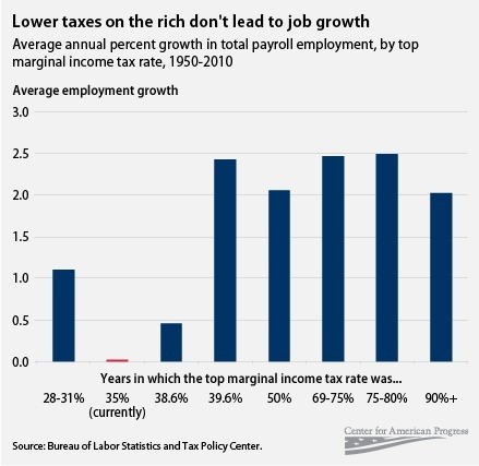
I stumbled on this interesting chart. The data is reported to be from the Bureau of Labor Statistics.

The blogger writes: “In theory, the GOP is so committed to resisting tax hikes because it’s so committed to creating jobs. “The fact is you can’t tax the very people that we expect to invest in the economy and create jobs,” says Speaker John Boehner. But Michael Linden’s chart comparing average annual job creation at different marginal tax rates begs to differ:”

Blog post can be found at: http://www.washingtonpost.com/blogs/ezra-klein/post/tax-rates-and-job-creation-in-one-graph/2011/05/19/AGh9Z1oH_blog.html Continue reading »

Income Inequality Widens

October 2011

From Congressional Budget Office Report:

  • “For the 1 percent of the population with the highest income, average real after-tax household income grew by 275 percent between 1979 and 2007 (see Summary Figure 1).
  •  For others in the 20 percent of the population with the highest income (those in the 81st through 99thpercentiles), average real after-tax household income grew by 65 percent over that period, much faster than it did for the remaining 80 percent of the population, but not nearly as fast as for the top 1 percent.
  •  For the 60 percent of the population in the middle of the income scale (the 21st through 80th percentiles), the growth in average real after-tax household income was just under 40 percent.
  •  For the 20 percent of the population with the lowest income, average real after-tax household income was about 18 percent higher in 2007 than it had been in 1979.

Read Report

PEW Poll: Worry about jobs trumps worry about deficit

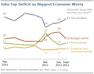
“A Pew Research Center/Washington Post poll conducted Sept. 1-4 shows a steady rise since March – from 34% to 43% – in the percentage of those saying that the job situation is the economic issue that worries them most. Those citing the budget deficit as their top worry declined from 28% in May and 29% in July to 22% in September.”

Source: PEW Research Center
Continue reading »