New York Times Poll: Views on Obama, Congress, and Current Events

With another fiscal deadline looming in Washington, The New York Times and CBS News asked Americans for their opinion on the federal budget, government spending and the President’s job performance–as well as Congress’s job performance, iews on the vaffordable health care, who to blame for a government shutdown, and possible budget cuts.
While the President is not seen as doing a good job, Congress is perceived even more poorly, with an 80 percent disapproval rating. Most people are not pleased with the idea of a government shutdown, and while there is plenty of shared blame, Republicans are somewhat more likely to be held accountable. There are indeed negative views about ObamaCare, although finer analysis might show variations based on how well people understand the law. Interesting, when it comes to budget cuts, about half of the people surveyed identified the military.
The survey results can be found here: Click Here

The poll provides an excellent description of how the poll was conducted, margins of error, and other nonsampling errors. Check it out: Click Here

Poverty in America

The Census came out with the latest figures on poverty in America:

The data presented here are from the Current Population Survey (CPS), 2013 Annual Social and Economic Supplement (ASEC), the source of official poverty estimates. The CPS ASEC is a sample survey of approximately 100,000 household nationwide. These data reflect conditions in calendar year 2012.

  • In 2012, the official poverty rate was 15.0 percent. There were 46.5 million people in poverty.
  • For the second consecutive year, neither the official poverty rate nor the number of people in poverty at the national level were statistically different from the previous year’s estimates.
  • The 2012 poverty rate was 2.5 percentage points higher than in 2007, the year before the most recent recession.
  • In 2012, the poverty rate for people living in the West was statistically lower than the 2011 estimate.
  • For most groups, the number of people in poverty did not show a statistically significant change. However, between 2011 and 2012, the number of people in poverty did increase for people aged 65 and older, people living in the South, and people living outside metropolitan statistical areas.
  • The poverty rate in 2012 for chil­dren under age 18 was 21.8 per­cent. The poverty rate for people aged 18 to 64 was 13.7 percent, while the rate for people aged 65 and older was 9.1 percent. None of these poverty rates were statistically different from their 2011 estimates. Click Here

The Census provides a PDF file that looks at poverty over time: Click Here

Continue reading »

Income Inequality continued

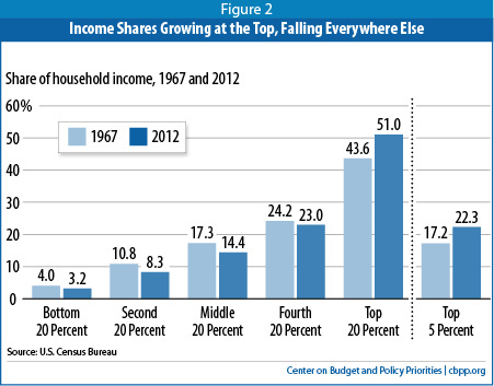
The Center on Budget Policy and Priorities has provided more information about the latest Census report on Poverty and Health Insurance. Once chart compares the income shares by quintiles of 1967 and 2012.
income shares


To read article: Click Here

The article notes that there may be some challenges in accurately capturing the income of those at the very top, and therefore accurately measuring changes. They write:
“Other data suggest the Census figures may underestimate the rise in inequality. Census trends on income inequality must be regarded cautiously because of large gaps in the Census income data, especially the omission of substantial income going to people high on the income scale. For example, Census does not collect data either on capital gains income or on salaries above $1,099,999; an individual whose salary rises from $20 million to $25 million between 2011 and 2012 is recorded as earning $1.1 million in both years.”

How the 1 percent made out during the recovery

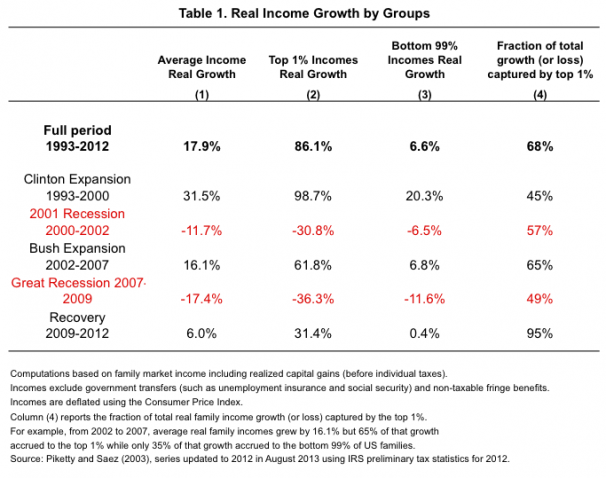
Clearly, the issue of income and income inequality is trending. Among the articles with data is one from the Washington Post. It is a chart that shows how the top 1 percent made out over the past twenty years as compared to everyone else. It is also a good example of how simple averages can mislead–the difference between the overall average and the average for the 1 percent and the other 99 percent are quite different.

1 percent recovery


See article: Click Here


More on Income Inequality

The Center for Budget Policy Priorities posted a guide to historical trends on Income Inequality. Clearly, income inequality has been growing since the 1970s, returning to a level not seen since the Great Depression (1929). See the full report: Click Here
Among the many charts and tables, I think these two are very interesting.
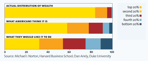
One shows a comparison between income distribution and wealth distribution:

cbpp wealth and income distribution


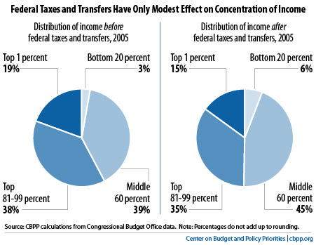
The second shows the distribution of income before and after taxes. There is a redistributive effect, but not as much as I assumed there would be:

cbpp income before and after taxes

So Far, Majority of Americans Oppose Missile Strike in Syria

Q: The United States says it has determined that the Syrian government has used chemical weapons in the civil war there. Given this, do you support or oppose the United States launching missile strikes against the Syrian government?
59% oppose, 36% support launching missile strikes.

Even more oppose arming the rebels: 70% oppose, 27% support.

The Washington Post – ABC News poll: Click Here
The Post-ABC poll was conducted by telephone Aug. 28-Sept. 1, 2013, among a random national sample of 1,012 adults, including users of both conventional and cellular phones. The margin of sampling error for overall results is plus or minus 3.5 percentage points.

Tracking Congress:
Where Things Stand, as of September 4th,
Aaron Blake, published his whip count on the Washington Post Blog:

22 Senators are for, 50 are undecided. 22 are against or leaning that way.
19 Representatives are for, 103 are undecided, and the rest are against or leaning that way.
Click Here for charts
Cost of Health Insurance

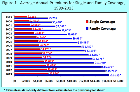
An article in the NY Times’ Economix by UWE E. REINHARDT reports on the Kaiser Family Annual Survey findings on the cost of health insurance: “The survey in question is the Kaiser Family Foundation’s annual survey of employment-based health insurance, widely viewed as a gold mine for anyone seeking information on that part of the American health system. The full report is easily accessible, or readers may prefer to read just the summary or browse through the fine group of charts the foundation provides. Here is a telling chart from that pack.”

This chart, shows the costs (not controlled for inflation–i.e. current dollars) over time and doesn’t compare benefit packages–so there are some caveats here. If I was assigning a research project, I would ask students to look at the rate of inflation over this same time period and look at rates of change, to see whether the insurance premiums have tracked with inflation. Alternatively, I could ask students to to convert these to constant dollars, so that the rate of inflation is controlled and therefore can be compared.
health insurance chart


To read the NY Times post: Click Here